Table of Contents
The year 2025 has marked a significant evolution in the way digital design is conceived and executed, moving decisively beyond surface-level visuals to play a central role in business growth and brand perception. At Open Designs, the projects delivered this year offer a clear reflection of how shifting user expectations, advancing technologies and performance-driven goals are reshaping web development companies in Chennai.
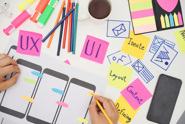
The design directions we explored in 2025 highlight a balance between simplicity and depth, where clean visual structures coexist with engaging interactions and meaningful content hierarchy. This trend analysis draws from the patterns, approaches and creative decisions observed across our projects, offering insight into the dominant design movements that defined the year. Through the lens of Open Designs’ works, this blog outlines how contemporary website design evolved in 2025 and the principles that continue to influence its future.
Out of the many websites launched this year by Open Designs, we will be discussing top 4 works.
LunchBowl
Purpose & core message
The LunchBowl website communicates its intent immediately that it offers healthy, dependable lunch solutions for children. The messaging is parent-focused and benefit-driven, emphasizing nutrition, consistency and everyday convenience. This clarity helps users quickly understand the value proposition without unnecessary explanation.
Visual Style
The design adopts a bright, cheerful visual language that aligns well with a child-centric food brand. Friendly colors and approachable typography create a warm, welcoming feel. The visual consistency across pages strengthens brand recognition and trust.
Layout & Content Flow
The website follows a clean, structured layout that makes information easy to scan. Content is broken into logical sections, guiding users from introduction to service details smoothly. Key highlights such as benefits, menus and subscription information are presented without visual clutter, keeping the experience focused and digestible.
Overall Design Impact
LunchBowl’s website prioritizes usability and communication over visual excess. Its strength lies in aligning design choices with audience expectations, resulting in a practical, trustworthy and purpose-driven digital experience that effectively supports the brand’s goals.
Super Chennai
Purpose & Core Message
The Super Chennai website positions itself as a platform that celebrates the city’s identity, progress and collective spirit. The messaging highlights Chennai as a dynamic, forward-looking metropolis, focusing on culture, innovation and community involvement. Visitors quickly understand that the site is driven by a larger mission rather than a commercial objective.
Visual style
The visual language is bold and energetic, reflecting the vibrancy of the city itself. Rich imagery and strong visual elements help bring different aspects of Chennai to life. The overall tone feels expressive and confident, aligning well with a city-pride narrative.
Layout & Content Flow
The site follows a structured, story-driven layout. Content is divided into clear sections, each focusing on a specific theme or aspect of the city. Prominent headings and short content blocks make the page easy to scan while still delivering impactful messages. The site invites users to contribute, volunteer or become part of the initiative, making the experience interactive rather than passive. This reinforces the platform’s goal of building a shared sense of ownership and pride.
Overall Design Impact
The Super Chennai website succeeds in combining visual storytelling with functional clarity. Its design choices support emotional connection, easy navigation and meaningful engagement, resulting in a digital experience that feels purposeful, inclusive and inspiring.
VGK builders
Purpose & Core Message
The VGK Builders website establishes itself as a platform for a reputable real estate company focused on crafting homes and communities that reflect personal aspirations. The messaging centers on transforming the idea of a home into a space filled with memories rather than just structures. This purpose-driven language helps set an emotional tone and positions the brand as more than a typical builder.
Visual Style & Branding
The visual approach leans toward a professional and authentic real estate presentation. Imagery showcases different property categories like apartments, villas and plots which helps visitors quickly understand what the company offers. The use of clean typography and structured content gives the site a confident, established look that aligns with the company’s years of experience.
Layout & Content Flow
The content is organized in a structured format that highlights key sections such as ongoing projects, completed developments, and testimonials. Each section is clearly labeled, making it easy for users to jump to the information they want. Project details are presented in a grid or list format, helping visitors scan available options like apartments, villas and plots efficiently. Calls to action such as “Enquire Now” or “Book a Site Visit” appear throughout, encouraging user interaction without overwhelming the layout.
Overall Design Impact
Overall, the VGK Builders website balances functional clarity with purposeful storytelling. Its design supports easy browsing of properties, builds emotional resonance around the idea of home, and integrates trust-building elements that help convert visitors into potential leads. The site feels structured, informative and aligned with the expectations of home buyers looking for reassurance and clarity.
Claritas
https://claritasrecyclers.com/
Purpose & Core Message
The Claritas Recyclers website clearly communicates its mission of promoting sustainability through professional paper recycling and waste management. The content emphasizes environmental responsibility, resource recovery and a circular economy, helping visitors quickly understand the company’s role in turning waste paper into valuable resources.
Visual Style & Branding
The visual identity feels grounded and purposeful, using imagery and text that support the idea of environmental impact rather than flashy aesthetics. This choice aligns with the brand’s focus on sustainability and practical solutions, giving the site a professional, mission-oriented look.
Layout & Content Organization
Content is organized into easily digestible sections showcasing services, process workflow, and collection points across regions. Clear headings and structured blocks make it simple for users to find information related to waste collection, sorting, recycling solutions, and consulting services. The use of process visuals or sequential steps helps break down complex information into manageable parts.
Overall Design Impact
Overall, the Claritas Recyclers website balances clarity with mission-driven communication. Its design supports easy exploration of services and processes while reinforcing the company’s commitment to sustainability. The result is a functional, informative digital experience that feels aligned with the organization’s environmental goals.
The design trends observed across the web design services handled by Open Designs in 2025 highlight a clear shift toward purpose-driven, user-first digital experiences. Regardless of industry of food services, community platforms, real estate or sustainability-focused enterprises, the common thread lies in clarity, structured storytelling, and alignment with brand intent. As we move forward to 2026, these trends signal a future where websites act as living brand systems.