
Table of Contents
Introduction
We are in a world where creating a website that excels on small screens is no longer an option; it’s a part of the impression. As businesses compete for their mark in online presence, mobile-first design has emerged as the gateway to achieve success. If you’re seeking the best web design company in Chennai to transform your online presence, you’ve arrived at the right destination.
Let’s see through mobile-first design and find out why it’s a big shot and how you can make a mobile-friendly website!
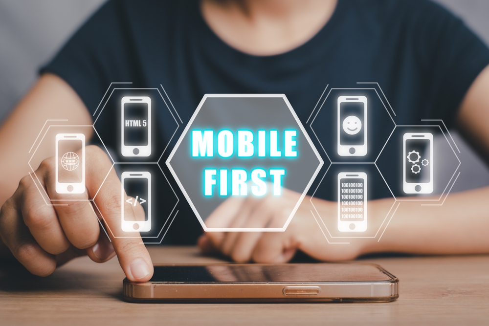
What is Mobile First Design?
Mobile-First Design is a web development approach that prioritizes designing for mobile devices before considering larger screens. Recognizing that most people use smartphones to access websites, mobile optimization should be the starting point for web design
The Importance of Mobile first designs
In recent times, people have increasingly turned to mobile devices as their primary means of accessing websites.This has led search engines like Google to favor websites that are designed for mobile devices. Therefore, if your website is not mobile-friendly, it is likely to rank lower in search results.
In addition to improving your website’s search engine ranking, designing for mobile devices also ensures that your visitors have a positive and enjoyable experience when accessing your site from their smartphones or tablets. If you are looking for web design services in Chennai, consider hiring a company that specializes in creating mobile-friendly websites to reach this growing audience.
Here are some other reasons why mobile-first design is so necessary:
Why Mobile-First Design Matters
Connecting with people
Nowadays, people rely heavily on their mobile devices to access the internet. This is true for individuals from all backgrounds and walks of life. Therefore, it is crucial to design websites with mobile users in mind. A Mobile-First Design approach guarantees that your website is easily accessible to everyone, anywhere, no matter what device they are using.
Getting accepted by search engine
Search engines favor websites that are easy to use on mobile devices. By making your website mobile-friendly, you can improve the overall user experience and increase your chances of appearing higher in search results.
Catch Users’ Attention
People’s attention spans are shorter than ever, especially when using mobile devices. So, it’s important to grab their attention quickly and keep them interested. Mobile-First Design does this by simplifying content and making it easy to use. This keeps people engaged and reduces the number of times they leave your website or app.
Suits all screen size
A well-designed website should be easy to use and navigate on all devices, regardless of screen size. This is where a mobile-first approach comes in. By starting with the design of the smallest screens and then working up to larger ones, you can create a website that is optimized for all users.
Advantage over competitors
In an ever-changing world, it’s important to keep up with the latest trends. By using a Mobile-First Design approach, you can not only meet the needs of your users but also show that your company is innovative and cares about its customers. This can give you a significant advantage over your competitors.
Best Practices to Make Mobile First Design Rock
Make it user-interactive
Prioritize and adapt your content for mobile users. Concise, engaging, and easily understandable content is essential for keeping mobile users interested.
Choose Visual Voice
Make your content easy to follow by organizing it visually. Use different fonts, colors, and images to help people quickly find the information they need.
Avoid chaotic pop-ups
Small pop-up windows can be annoying on mobile devices, even if they are acceptable on larger screens. Use them only when necessary and make sure they are easy to close so that you don’t upset your mobile users.
Test, Test and Go live
Before making your website live, make sure it works well on mobile devices. Try it out on different phones and tablets to find any problems. Fix these problems so that everyone can use your website easily.
Conclusion
On the whole, it’s crucial to adapt and embrace new trends to stay ahead of the curve. A Mobile-First Design approach is no longer just a choice but a necessity for any business seeking online success.
When you choose the best web design company in chennai, your website will be optimized for viewing and interacting with on mobile devices, which have become the primary means of accessing the internet for many people. By prioritizing the mobile experience, you’re more than just meeting expectations, you’re exceeding them.


