Table of Contents
When you look into some illustration or any piece of art or gape at anything for the matter, if it’s too jam packed, it becomes a little complicated to understand or at least takes some time for understanding. But when you look at something that has little empty spaces here and there, it becomes a little more clear. The comprehensive power varies from person to person, yet the time required for them to analyze will definitely be lesser when compared to conjusted ones. This is where empty spaces made their significance and stands to be the driving force of attraction. These white spaces are so special as they make sure the main content is outstanding to the viewers, at the background being the supportive unseen cause for outstanding.
Attention is an important factor in marketing. But when your content possesses too many attracting factors, then that becomes a distracting feature. Keeping your content intentionally blank is the key for a good display. If you don’t get the point, then have a quick search on websites that are rated the worst.
This unseen thing lays its importance in three crucial areas.
- Understanding becomes easier
You want to clutter your webpage? Think about it once and don’t do it. That’s a bad idea which could turn away the viewers and never let them think of returning again. This could be a negative impression that you page gains by cluttering all the ideas together. It’s informative, true. But right now the point is that, did you earn any readers? Well, only if your webpage got readers, they would classify it into informative or not. Else, to them, it’s just garbage.
In such cases, work out on indents, margins of the page, making the font pleasing at least not turning them away. This has proved the increase of viewers and readers to about 20%. Manipulating this white space is a skill. It makes it simple for readers to concentrate on what they need and if there is content irrelevant to them, they would rather strip them off.
You could use this magical space in several ways.
- This is the text spacing. Your entire content can be presented well by separating the text columns and each text and paragraphs could have considerable space between them.
- The next would be the visual space. The white space enclosing the icons, illustations and video contents creates good readability.
- The last thing is the layout space.
The medium of interaction.
There could be cascading pages in your websites. It might be a too large unimaginable content. But what serves the tour guide? Ofcourse that’s your homepage. Giving a neat and clean picture of the website is required in your homepage. How uniform the alignments are in this page decides whether you have people falling for your website or they may fall sick after looking at it. Balancing the white space usage creates stability for your page. Put yourselves under the soes of visitors and think of how well i get attracted to this page. Now you may find out the little dents in your webpage.
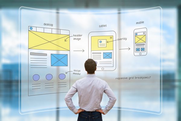
Apart from the comprehending of content, users go through a rapid phase of routing. The navigation among the webpage content is easier when there is a balanced white space usage. You could do some small research on white spaces. The header and footer white spaces distinctly give the actual content. When you focus a litte more deeper, you can actually feel the functionality of the white space. It creates a mental map where it gets fixed in the mind that this area is for a particular content. Clearly said, it functions as the content distributor. When this white space is lost, it becomes difficult to navigate through the page.
- Relationships clear and better
There comes a behavioral change when a small white space fits in the frame. This is the interactive design portion which creates difference in the way the content is exhibited. When the label for the text is placed closer to it with the right font and right space, it becomes evident that this space is for this particular text. Getting rid of confusions is another benefit that comes from the white space usage.
There are times where the content is too large and the paragraphs are very confusing as to which label it belongs to. So, having considerable space between each paragraph and the space between the label and the corresponding text gives clear understanding of content.
When it comes to filling up forms, if you don’t have proper indents and spacing’s, it may even cause viewers to ignore your page. When your site is a review related one, then this could cause a big drawback resulting in scanty viewers or even none.
- Attention seeking
The void created by other contents promotes for exhibiting the actual contents to stand out for the readers. White space for attraction depends on the human attention as well as memory limits.
You can have a comparison with various search engines and get to know why google has made its roots strong. Not just the ideas that it comes up with, it’s the way it establishes itself to the crowd. If attention seeking clutters the page, then remember you are just losing the customers.
Make sure there is reduced attention seeking factors so that it doesn’t spoil the UI and white space could facilitate it better.
FAQ
Does dark mode website design really help your business?
Dark Mode website design has been adopted by some of the biggest technology giants out there. Needless to say dark mode is projected as a beneficial aid to the customers who use their tech rather than as a beneficial feature to the service provider. Dark Mode is easy on the user’s eyes, especially in low light or at night. The dark design stretches their battery consumption enabling them to spend longer hours on their phones without having to charge the phone. The design is also aesthetic focussing more on text over a dark background that pops out. The search engine doesn’t have a preference for dark mode over light, but the higher number of users automatically signals the search engine to improve the ranking of the site.
What are the newest trends in website design?
Website design has come a long way from the basic blue and white theme with black text to colourful, interactive spaces that have become even primary source of income for businesses. Here are the latest trends in web design that will keep you on top of the industry. Parallax Animation: The foreground is designed to move faster than the background creating a 3D visual effect. Neumorphism: Digital embossing with soft backgrounds with overlay elements that have a shadow to lift them off the screen. Dark Mode: Like mobile apps websites too are turning to dark mode to give viewers a comfortable experience. Pastel Colours: Businesses are going with pastel colour themes to give a visually soothing customer experience. Scrolling transformations: The elements on the screen are designed to move and transform with scrolling creating a video like effect.
What is the best way to build your website?
Congratulations on your decision to make a website for your business. Follow these steps for the best way to build a successful website.
- Choose a web developer. Find a web developer with experience and knowledge of website design.
- Choose an initial web template. Select a suitable template and ask your developer to build and customise on it.
- Edit and Review the site. Insert your content, images and graphics in the website. Before launching it, test the site’s performance to work out the kinks.
- Create a domain. A domain is the unique address of your site and has to be registered with a domain provider.
- Publish your website: Now that your website is designed and done, you are ready to publish it.
What is the difference between website design and website development?
When searching for a web developer, it is important for you as a client to know the difference between website design and website development. The difference is quite distinct but a web developer is capable of doing both if they are skilled enough. Web design is the initial ideation and planning of a website’s layout, appearance and content. Web development is the actual process of developing code for creating the site and its subsequent maintenance. Web design is about creativity, while web development is completely technical. You need to engage the services of web developers who can help you with both, as they know how to recreate your brand personality on the website.